How colors influence work performance, creativity, and mood
The human mind is very sensitive to color perception. Their effect influences us at every step, and our working environment is no exception. According to designers, it is therefore necessary to choose color tones in offices with particular care, with an emphasis on productivity, creativity, and the overall dynamics of the environment. Which colors should you choose? And should you go for simplicity or diversity?
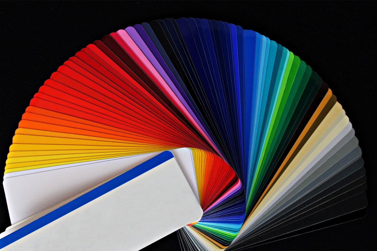
Basic color palette
You should combine at least two colors that complement each other. However, three colors in a ratio of 60:30:10 also look good, with the first being dominant, the second complementary, and the third appearing in the details. This prevents the whole from becoming distracting and overcomplicated.
Then all you have to do is choose one of the light neutral tones, such as white, beige, or gray. White symbolizes purity and freshness, but large white surfaces can be too sterile and sometimes even tiring and energy-sapping. An alternative is cream, beige, or light gray. These shades sound softer and cozier and harmonize the entire space. On the other hand, be careful with black and use it only as an accent. Otherwise, it tends to evoke unpleasant or even depressing feelings.
Warm or cool shades?
Choosing from the color spectrum of warm and cool shades depends on many factors, such as your field of work or whether your office faces south or north. Warm colors not only feel warm, but also increase creativity and are suitable for chill-out zones because they promote relaxation. On the other hand, cool shades can visually cool offices in the summer heat, improve concentration, and if they have a blue undertone, they should also have relaxing effects.
Modesty or extravagance?
According to designers, it is ideal to combine energetic and calming tones. This means that yellow, red, or orange, for example, go well with beige, gray, green, or blue. However, the rule of moderation applies here as well. You can use these colors on individual pieces of furniture and use white, cream, or beige walls as a backdrop. Alternatively, set a rule for choosing the colors of tables, chairs, and accessories and stick to it throughout the space. This will create an original, tasteful, and cohesive scheme.
The meaning of individual colors
In addition to the aforementioned white and black, other colors are also interesting from a symbolic point of view. So let’s take a look at the meaning and possible uses of the most popular shades. What do they mean? And where can they be used?
Beige
In addition to neutral tones, easily combinable, timeless, and cozy beige is also used in offices. It is ideal where you need to achieve a serious impression. However, it can also be an interesting background for striking motifs on accessories and decorations.
Gray
Shades of gray are usually used in combination with another distinctive or bright color. On their own, they can be boring or even tiresome. However, their advantage is that they create a calm, undisturbed atmosphere.
Green
The shades of green will make you feel like you are in the middle of nature in your office. This color has an anti-stress effect and overall has a very positive vibe. And if the green element comes from plants, you can also enjoy cleaner and healthier air.
Blue
If you are interested in the meaning of the color blue, it is known to calm and promote concentration. In its lighter shades, it resembles the sky, making spaces feel more open and slightly larger. It goes well with neutral white, gray, and light green.
Yellow
The meaning of yellow is associated primarily with creativity and productivity. However, designers also recommend it for meeting rooms and training rooms because it aids concentration and has a positive effect on memory. It is not suitable for small spaces and is better suited to details than large areas.
Red
You shouldn’t overdo it with red in administrative buildings, but on the other hand, you don’t have to avoid it altogether. It is ideal for kitchens or cafés because it stimulates the appetite. In addition, it stimulates passion and motivation to work.
Orange
Orange is the color of playfulness and team energy. It is therefore suitable for relaxation areas as well as social spaces where employees meet. It creates a warm and relaxed atmosphere, promoting openness and communication.